
Effective project management requires a solid grasp of planning, tracking, and monitoring. One of the best tools at a project manager’s disposal is project management charts. These charts visually represent data, helping managers organize tasks, allocate resources, track progress, and ensure projects are delivered on time and within budget.
But with so many chart types available, which ones are most effective? In this blog, we’ll explore the 14 most commonly used project management charts, explaining how they can help you stay organized and meet your project goals.
What Are Project Management Charts?
Project management charts are visual tools used to represent the various aspects of a project, such as timelines, resources, tasks, and risks. They help project managers and teams track progress, spot bottlenecks, allocate resources, and make data-driven decisions. By providing a clear picture of a project’s current status and future trajectory, these charts are indispensable for keeping projects on track.
Why Are Project Management Charts Important?
- Clarity: Visuals are often easier to interpret than complex spreadsheets or lengthy reports.
- Improved communication: Charts help communicate project status quickly and efficiently to all stakeholders.
- Better planning: With clear data on task assignments, resources, and deadlines, project managers can adjust plans as needed.
- Progress tracking: These charts help track milestones and ensure that everything is moving according to schedule.
- Risk management: Project managers can identify potential issues early and mitigate risks.
Now, let’s dive into the 15 most commonly used project management charts.
1. Gantt Chart
A Gantt Chart is one of the most widely used tools in project management. It provides a detailed timeline view of the project by breaking down tasks, their durations, and deadlines. Each task is represented as a horizontal bar, and its length corresponds to the time required to complete it.

- Best for: Tracking project timelines and task dependencies.
2. PERT Chart
A Program Evaluation and Review Technique (PERT) Chart helps in visualizing a project’s workflow and estimating the time required to complete different tasks. It focuses on task dependencies, highlighting the critical path that must be completed on time to meet deadlines.
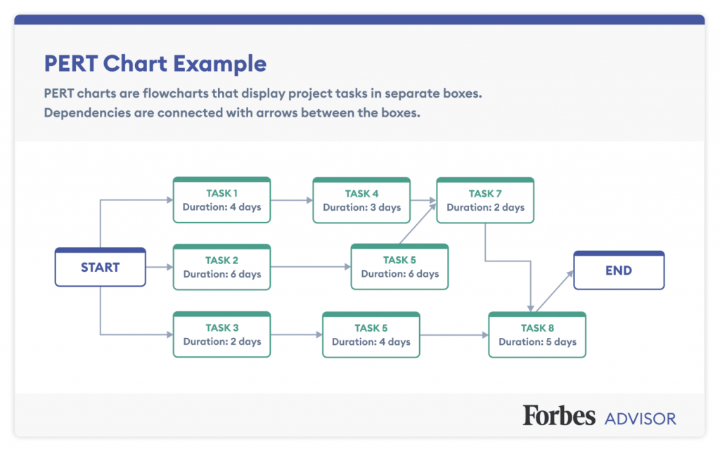
- Best for: Identifying critical tasks and optimizing timelines.
3. Kanban Board
The Kanban Board is a visual workflow management tool, typically used in agile methodologies. It divides tasks into stages (e.g., To Do, In Progress, Done), helping teams see task status at a glance and move items through different stages as they progress.

- Best for: Visualizing work stages and managing workflow.
4. Work Breakdown Structure (WBS)
The Work Breakdown Structure is a hierarchical chart that breaks a project into smaller, manageable components. It allows project managers to assign tasks more easily and provides clarity on task ownership.
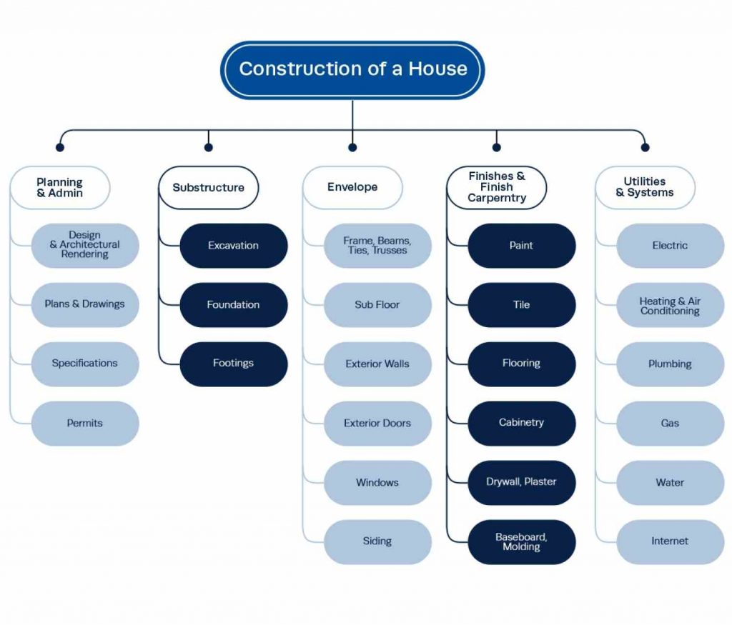
- Best for: Breaking down complex projects into smaller tasks.
5. Flowchart
Flowcharts visually map out the steps in a process. In project management, they’re often used to identify how various tasks are interconnected and to define workflows.

- Best for: Mapping processes and workflows.
6. RACI Chart
A RACI Chart (Responsible, Accountable, Consulted, Informed) is used to define roles and responsibilities in a project. It ensures that every team member knows what they’re accountable for, and who should be consulted or informed.

- Best for: Defining roles and responsibilities.
7. Timeline Chart

A Timeline Chart presents a project’s schedule along a linear timeline, showing major milestones, deadlines, and deliverables. It offers a broad overview of project progress.
- Best for: Visualizing the overall project timeline.
8. Burndown Chart
Burndown Charts are often used in Agile project management. They show how much work remains in a project (or sprint) and track progress over time, helping teams adjust their efforts as needed.
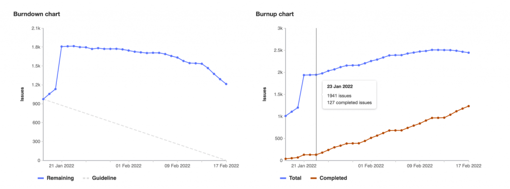
- Best for: Tracking progress toward project completion in real-time.
9. Cause-and-Effect Chart (Ishikawa Diagram)
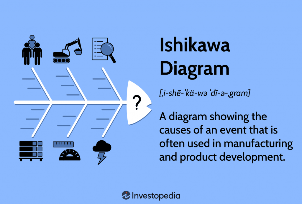
A Cause and Effect Chart, also known as a Fishbone Diagram or Ishikawa Diagram, is a visual tool used to identify and analyze the root causes of a particular problem or effect. Named for its fishbone-like appearance.
- Best for: helps teams break down and categorize potential causes into distinct categories, making it easier to understand the underlying factors contributing to an issue.
10. Milestone Chart
Milestone charts focus on significant events or checkpoints in a project’s life cycle. Each milestone represents a major point of progress, such as completing a phase or hitting a key delivery date.
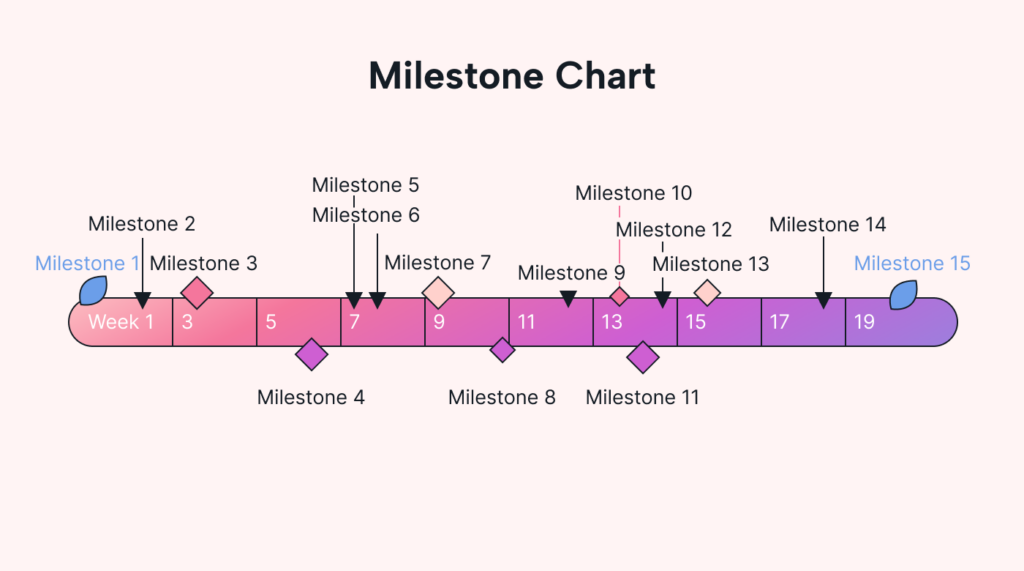
- Best for: Tracking key project milestones and deadlines.
11. Activity Network Diagram
The Activity Network Diagram shows the sequence in which tasks must be completed. It highlights task dependencies and critical paths, helping project managers optimize the project schedule.

- Best for: Analyzing task dependencies and project schedules.
12. Project Roadmap
A Project Roadmap is a high-level view of a project’s goals, timelines, and key deliverables. It’s used to communicate overall project direction and progress to stakeholders.
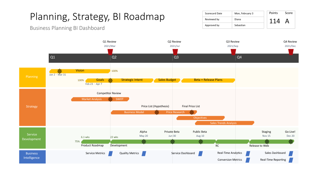
- Best for: Providing a big-picture view of project progress.
13. Histogram
A Histogram shows the distribution of data over time and can be used to track project-related metrics, such as resource allocation, task completion rates, or team performance.
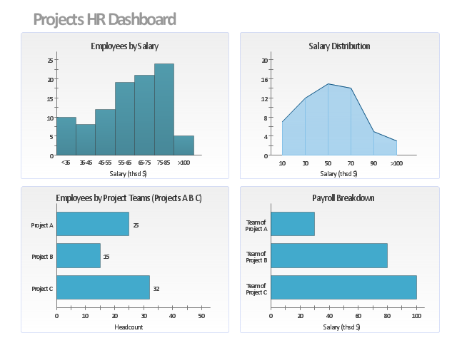
- Best for: Visualizing project data trends.
14. Pie Chart
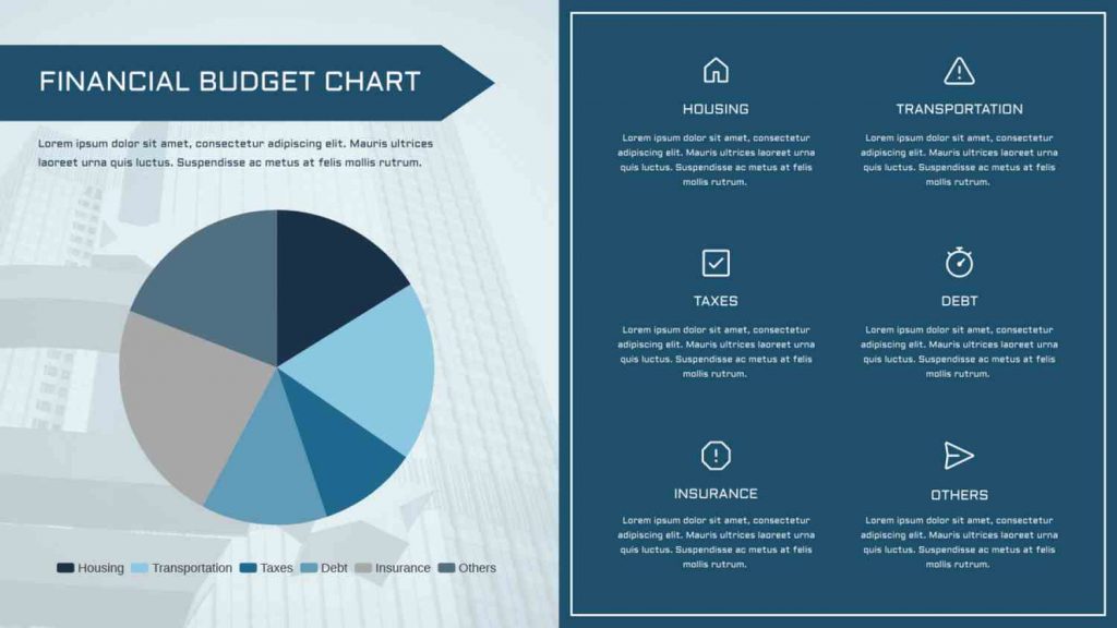
While not as common as other project management diagrams on this list, pie charts can help visualize the proportional distribution of a specific category. These are circular charts divided into sectors, illustrating numerical proportions.
- Best for: Presenting budget allocation, resource distribution across teams, and customer demographics (limited to a single variable).
Conclusion
Project management charts are more than just tools for tracking progress—they’re essential for organizing tasks, managing resources, and ensuring that projects stay on track. By using the right chart at the right time, you can enhance communication, make better decisions, and deliver successful projects.
Whether you’re managing a small project or a complex initiative, project management charts will help you stay organized, maintain clarity, and ensure your projects succeed. At Baskin Advisory Group, LLC, we specialize in helping businesses implement project management best practices, including the strategic use of these charts. Contact us today to learn how we can help you optimize your project management processes.